
Using the `table` DataViewMapping in Power BI Custom Visuals
The Power BI custom visuals SDK allows you to define DataViewMappings for your capabilities.json file. In short, these define how the data in your visual fields, or dataRoles get mapped when they are exposed to your custom visual.
I’ve recently been asked if I have any examples of the table mapping. The link above does a pretty good job of explaining them conceptually, but there don’t seem to be many examples around.
The majority of examples (and open source code to learn from) tend to lean on the categorical mapping, as it’s pretty good at what it does for the majority of cases people have. So, I thought I’d document a simple example of how a table mapping might work.
Before we Begin
I’m planning to spend more time on unpacking the concepts of the custom visuals SDK later on in a series of beginner’s tutorials.
This article assumes at least some knowledge of setting up a development environment and working with some of the basics, so this article may not be for you if you haven’t done anything with the SDK (just yet).
Still interested? Cool! Let’s press on…
Finished Recipe
To illustrate the table mapping, we’re going to create a simple HTML table in our visual container, where the field behaviour mimics that of the core table visual, i.e. we can add fields to a Values container and these fields will be included in our visual:
For those who wish to have a go, the source code for this complete example is available here on GitHub. Feel free to clone, fork or whatever it is you kids do these days ;)
We’re going to keep things as simple as possible, and I’m using a new visual project created using pbiviz new to minimise noise. I’m going to do everything in the update method of the visual.ts file, so a real-world visual would abstract this code away to a more specific location. Anyway… enough chat, and let’s get on with the show!
Actual Recipe
Configuring dataRoles
Define the dataRoles as follows in capabilities.json:
1
2
3
4
5
6
7
"dataRoles" : [
    {
        "name": "values",
        "kind": "GroupingOrMeasure",
        "displayName": "Values"
    }
]
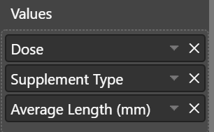
If we spin up our visual with pbiviz start, we’ll see a Values container in our properties pane, and we can add fields or measures to it, e.g.:
Configuring DataViewMapping
Before defining our mapping, let’s delete the categorical object under dataViewMappings in capabilities.json so it looks like this:
1
2
3
4
5
"dataViewMappings": [
    {

    }
]
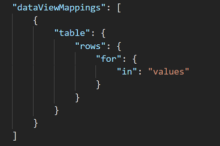
The key difference between table and matrix mappings is that table doesn’t have column mappings and just works with row. Let’s set ours up to manage our dataRoles:
1
2
3
4
5
6
7
8
9
10
"dataViewMappings": [
    {
        "table": {
            "rows": {
                "for": {
                    "in": "values"
                }
            }
        }
    }
When you make potentially breaking changes to the dataViewMappings, it’s a pretty good idea to restart your runtime by stopping pbiviz and re-running it. It should compile on change, but I’ve seen inconsistent results, so this is something I just do to make sure we’re on the new mappings.
To summarise what the above mapping does, it’s basically asking Power BI to:
- Get data for all fields in the list
- If they are measures, aggregate them, because the
dataRolesays it can be either a grouping or a measure. - But, if the repoprt author chose an implicit measure and doesn’t want to summarise it, get the unique values rather than the aggregate.
- Return these into an object named
rows, which should be an array of each unique set of values or aggregates.
This is how your data gets surfaced to the core table visual also.
Inspecting the Data & dataViewMapping
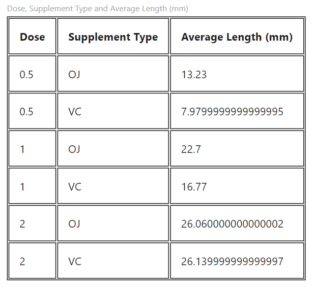
Let’s have a look at how the data gets represented in the way we’re used to by selecting Show data from the visual header, e.g.:
This confirms that our fields are getting into the visual, and we see our groupings on the left, with measures on the right. Note that if we shift the measures around, this represenation still works as shown above with respect to splitting up measures and groupings. The data view itself will retain the order in which fields are added, although it’s not guaranteed.
Update: if you set a measure to Do Not Summarize, it’s treated as a grouping and will show to the left of the dividing line also.
Now, let’s check the actual data view in our developer visual:
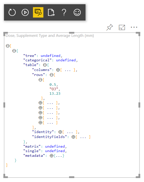
table objectI’ve expanded the tree, as well as the first item in the rows array so we can confirm presence of our data. To refer to this object later on in our code, we would use dataView[0].table.rows.
From this data, we can see that each item in the array for each row represents a value for a particular field. We can infer which is which based on what we know so far, but what happens if our user uses their own fields, or changes the order?
Fortunately, Power BI gives us a columns object, which contains the metadata for the fields we have added. Let’s expand this and have a look:
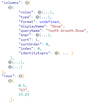
columns object in the developer visual data view.When we look at the first object in the columns object array, we can see that this represents the Dose field from our list. We can use this to treat the corresponding item in the rows object array as this field.
Processing the dataView
So, now we’ll process the dataView and draw a simple HTML table using d3.js, which is already loaded by default when the visual project is created.
Remember, if you get stuck or need to double-check your code, you can refer to the Git repo :)
Firstly, add d3-selection to the import list:
1
import * as d3select from 'd3-selection';
Amend the class properties to the following:
1
2
private settings: VisualSettings;
private container: d3.Selection<any, any, any, any>;
container will be an element that we append to the visual to draw the table.
Now we’ll remove the bits we don’t need from the constructor in visual.ts, as we’ll draw out table in the main element. Amend so that this looks as follows:
1
2
3
4
5
6
constructor(options: VisualConstructorOptions) {
    console.log('Visual constructor', options);
    /** Visual container */
        this.container = d3select.select(options.element)
            .append('table');
}
Amend the update method as follows - note that I like comments when writing examples, but it’s up to you if you want to add them in too!
1
2
3
4
5
6
7
8
9
10
11
12
13
14
15
16
17
18
19
20
21
22
23
24
25
26
27
28
29
30
31
32
33
34
35
36
37
38
39
40
41
42
43
44
45
46
47
48
49
50
51
public update(options: VisualUpdateOptions) {
    this.settings = Visual.parseSettings(options && options.dataViews && options.dataViews[0]);

    /** Clear down existing plot */
        this.container.selectAll('*').remove();

    /** Test 1: Data view has valid bare-minimum entries */
        let dataViews = options.dataViews;
        console.log('Test 1: Valid data view...');
        if (!dataViews
            || !dataViews[0]
            || !dataViews[0].table
            || !dataViews[0].table.rows
            || !dataViews[0].table.columns
            || !dataViews[0].metadata
        ) {
            console.log('Test 1 FAILED. No data to draw table.');
            return;
        }

    /** If we get this far, we can trust that we can work with the data! */
        let table = dataViews[0].table;

    /** Add table heading row and columns */
        let tHead = this.container
            .append('tr');
        table.columns.forEach(
            (col) => {
                tHead
                    .append('th')
                        .text(col.displayName);
            }
        );

    /** Now add rows and columns for each row of data */
        table.rows.forEach(
            (row) => {
                let tRow = this.container
                    .append('tr');
                row.forEach(
                    (col) => {
                        tRow
                            .append('td')
                                .text(col.toString());
                    }
                )
            }
        );
        console.log('Table rendered!');

}
Replace style/visual.less with the following, just to give our table some basic styling:
1
2
3
4
5
6
7
table, th, td {
    border: 1px solid;
}

th, td {
    padding: 15px;
}
Now, refresh the visual in your report and you should see something that looks like a table!
Wrapping Up
If you want to achieve the functionality of the core visual, there’s a lot more to cover that is beyond the scope of what we’ve done here, but hopefully what we’ve covered can be useful to people who wanted something to get started.
I’m intending to write a lot more about custom visual devlopment going forward, so I’d be keen to hear about any ideas you might have in the comments below. If I have the capacity to look into it, I’ll do my best to write about it.
Thanks very much for reading, and hopefully see you again soon!
DM-P :)